Microsoft has dropped the Honeycomb grid from Windows Mobile 6.5, just a month after it was launched.
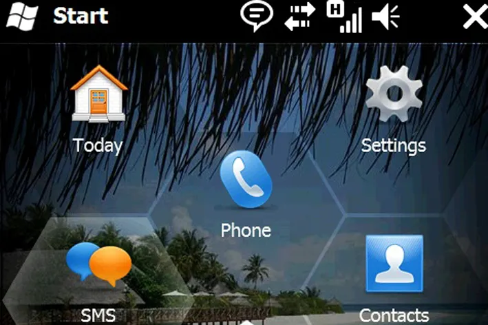
The stylised interface was one of the headline features in the latest version of the mobile operating system, providing a Honeycomb-pattern grid that was used to segregate large, touch-friendly icons.
However, when feedback started rolling in from Microsoft employees after internal testing it turns out not everybody was enamoured by the new look. This was proof enough for Microsoft that the interface needed tweaking.
The differences are slight. While the icons remain in the same place, they have been enlarged and the honeycomb grid axed.

The scrolling action has also been tweaked so that users no longer need to drag their finger to the edge of the screen to change page. Now the page will change the moment the finger leaves the screen.
Though the changes are minor, it's interesting that Microsoft felt the need to change the user interface even after the high-profile public unveiling.
Steve Ballmer has also voiced some doubts about the operating system, describing it as "not the full release we wanted".
Click here to find out which is the best mobile platform for business.
-
 Jitterbit eyes global growth under new CRO Chris Stoddard
News The former New Relic executive will lead the vendor’s worldwide go-to-market strategy and revenue growth plans
-
 This one cyber crime group accounted for nearly a fifth of all ransomware attacks in June
News The Gentlemen, a ransomware a service operator, now accounts for 17% of published attacks

