Google Galaxy Nexus review
Google's latest own-brand Android smartphone is here. Its massive high-resolution screen and brand new Ice Cream Sandwich operating system left a big impression on Julian Prokaza as our review reveals.
Slick hardware combined with a seriously refreshed version of Android make the Galaxy Nexus a very capable smartphone. The fact that it’s the only smartphone designed for Android 4 that's also actually available to buy right now only serves to make it more desirable.As good as it is though, we suspect other manufacturers will do better with new models early next year – especially with phones we can actually hold comfortably. So as tempted as we are, we’d hold onto our pennies for now.
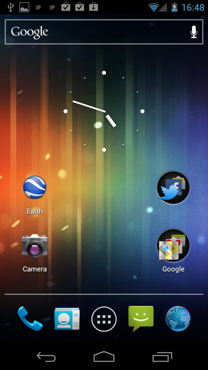
Android 4 is a good deal slicker than its Gingerbread predecessor and looks a lot like Honeycomb with its blue and black theme, although other smartphone manufacturers may still choose to hide Google's clean, clear user interface under their own fussier skin. The most obvious change is the loss of the capacitive buttons that sat below the screen on previous Android smartphones and these are now soft buttons rendered on the display itself. The buttons come and go (and rotate) as required, and an on-screen tap is required to restore them in apps that run full-screen, but that's no different to the backlit capacitive buttons of older phones dimming when not in use.

The Galaxy Nexus lacks the four physical system buttons founds on older Android phones they're now rendered onscreen instead.
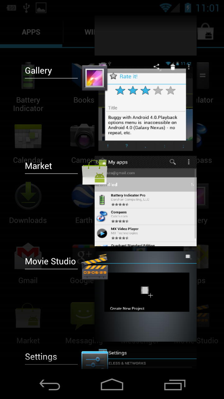
The dedicated Task Switch button which displays thumbnails of recently used apps is a welcome addition. The handy flick gesture for closing apps would be slick if it wasn't for the fact that it actually doesn't always close apps properly.

The dedicated Task Switch button is handy, but you may still need to use the actual task manager for force quitting uncooperative apps.
We're a little confused about the Context menu button. In some apps this sits at the bottom-right of the screen, in others it's at the top-right, which is a silly and confusing bit of inconsistency and inexcusable, since it happens in Google's own Android 4 apps. We also encountered minor compatibility issues with the Context button too, which didn't appear at all in some apps.
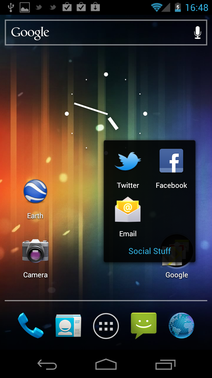
The Android 4 user interface hasn't otherwise changed dramatically from previous versions of the OS and it still uses multiple Home screens for app shortcuts and widgets. Widgets are now listed on their own tab on the Apps screen too, making them much easier to deploy than the old method of a long press on a Home screen. Apps can also be organised into folders on the Home screens by dragging one icon onto another, much like iOS.

Organise apps into folders by dragging and dropping them onto each other.
Sign up today and you will receive a free copy of our Future Focus 2025 report - the leading guidance on AI, cybersecurity and other IT challenges as per 700+ senior executives
-
 Google: we need more energy for AI
News Alphabet president calls for US to step up power generation to feed her company's AI ambitions
By Nicole Kobie Published
-
 Observability will be key to agentic AI safety, says Microsoft Security exec
News Agentic AI adoption will require a re-evaluation of enterprise risk management, according to Microsoft corporate VP
By Ross Kelly Published
-
 Enterprises need to think of agents as ‘digital co-workers’ – and that means implementing the same security safeguards
News Practices such as zero trust and least privilege will be needed as agents gain access to sensitive enterprise data
By Ross Kelly Published