Coronavirus has people worldwide on edge about traveling. So, if you’re planning a road trip, a new Google Maps feature is likely to put your mind at ease. Dubbed COVID-19, this new overlay can help you see how risky it is to travel to certain areas.
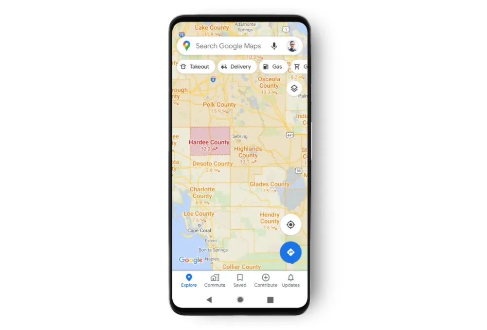
Once you enter a prospective destination, the COVID-19 overlay is easy to display. Simply press the layers button in the top-right corner and select “COVID-19 info.” Google Maps will then place an overlay on the map showing the seven-day average of new COVID-19 cases per 100,000 people in the area and a label showing if the cases are trending up or down.
To make it easier to see just how bad the infection is spreading in an area at a glance, Google also added color coding. The codes are as follows:
- Grey: < 1 case per 100,000 people
- Yellow: 1-10 cases per 100,000 people
- Orange: 10-20 cases per 100,000 people
- Dark orange: 20-30 cases per 100,000 people
- Red: 30-40 cases per 100,000 people
- Dark red: 40+ cases per 100,000 people
Google Maps provides data for all 220 countries it serves and even supports state-, county- and city-level infection numbers if available.

Google Maps pulls its COVID-19 data from a handful of reputable sources, including Johns Hopkins, the New York Times and Wikipedia. These sources get their information from the World Health Organization, government health ministries, and state and local health agencies and hospitals.
The new COVID-19 overlay will start hitting Android and iOS devices worldwide this week.

