PowerPoint has a rocky history with Mac users. A byword for the kind of dull, clunky slideshows that are accepted as a fact of life by executives but frowned on by creative professionals, it's often dismissed in favour of Keynote, Apple's less comprehensive but more aesthetically pleasing presentation app. This could be the moment, however, when PowerPoint fights back.

The difference is clear as soon as you launch the program. Like the other Office 2011 components, it opens incredibly quickly and displays an attractive welcome screen inviting you to explore the new features. You'd expect this to disappear when you click the Close button, but instead it flips around in 3D to show the Presentation Gallery on the back a neat touch that shows Microsoft has been paying attention to Apple's user interface design.
Most of the templates in that Gallery will be familiar from Office 2008, which considerably upped the standard of Microsoft's ready-made materials. New is the direct link to Microsoft's much larger collection online. Although it feels like an afterthought, we also liked the handful of Guided Methods example business presentations, using some of the latest features, whose authors have annotated the slide notes to explain why they made them the way they did. The tone is a bit entrepreneur-of-the-year, but for anyone unsure what a good presentation should be like, these are a very handy leg-up.
Within the app, the improvements continue. You'll immediately notice the new Ribbon interface, which works particularly well in PowerPoint, replacing a jumble of toolbars and palettes with a strip of clearly presented options that makes good use of whatever amount of screen width you have available. Losing old friends like the Formatting palette will initially have your mouse diving in the wrong direction, but after a while it all begins to feel quite natural. Adjusting your view is smoother, since the screen updates interactively when you drag either the new Zoom slider or the divider between your slide thumbnails and current slide.

-
 Palo Alto Networks targets application observability gains with latest acquisition
News The company will integrate Embrace features with its Cortex AgentiX service
-
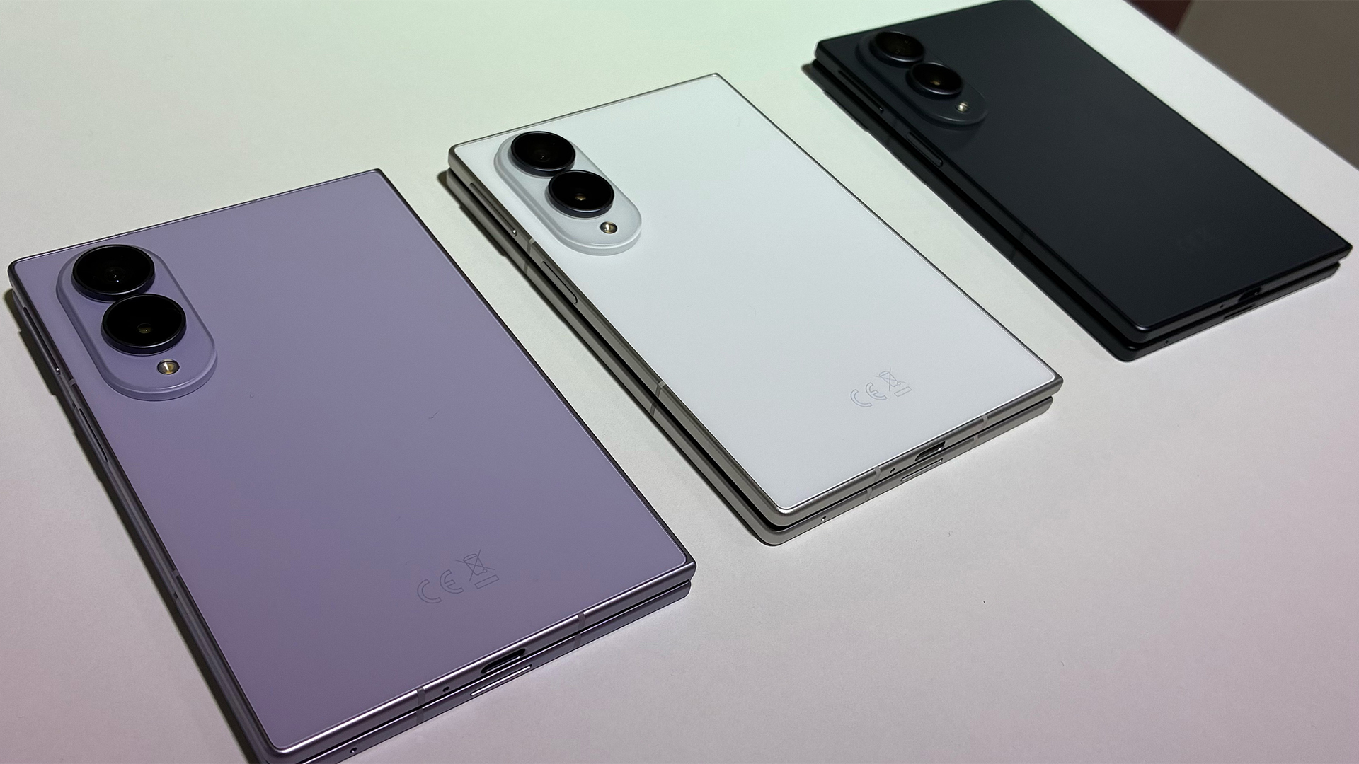 Samsung tests new shapes and materials for a more durable and immersive Galaxy Z Fold 8 line-up
News A new titanium structure reinforces the Samsung Galaxy Z Fold 8 Ultra, while the standard 8 sports a 3:4 ratio for more immersive content consumption
-
 An ‘unprecedented cyber incident’: How OpenAI models breached Hugging Face – and why it could herald a ‘new phase of AI-powered cyber crime’
News The incident should serve as a stark warning on the dangers of AI agents, according to cyber experts


