
Intel is amid a brand revamp, and one of the first orders of business, other than the launch of its 11th-generation Tiger Lake CPUs, is to unveil a new logo that’s modern and pays tribute to the brand’s storied past.
Since releasing its first logo in 1968 (pictured above), Intel’s mark had only one revision. That update was the “intel” within the open circle (shown below) seen on most computers from the mid-2000s. Several mild variations to the logo followed its 2006 launch, but the base design remained mostly the same.

Fourteen years later, the famed hardware manufacturer has launched an all-new logo (pictured below).

The “intel” font is a clear callback to the 1968 logo, but the new mark changes things up by pulling the “e” in line with the rest of the word and changing the font color scheme.

On top of the change in font, Intel has also announced new background colors. As you can see in the image, it’ll retain a blue theme, but Intel chose to use various blue shades to add depth and variation to the brand.
The logo’s not all that’s changing wither. Intel also has big plans for its iconic “bong” jingle. According to the press release, Intel won’t scrap the jingle altogether. Instead, it plans to modernize it.
Intel will reveal the new five-note jingle later in 2020. We’ll bring you updates as Intel’s brand refresh moves along.
-
 AWS hits back at EU cloud 'gatekeeper' designation hints
News Gatekeeper designation under the legislation would force AWS and Microsoft to make concessions
-
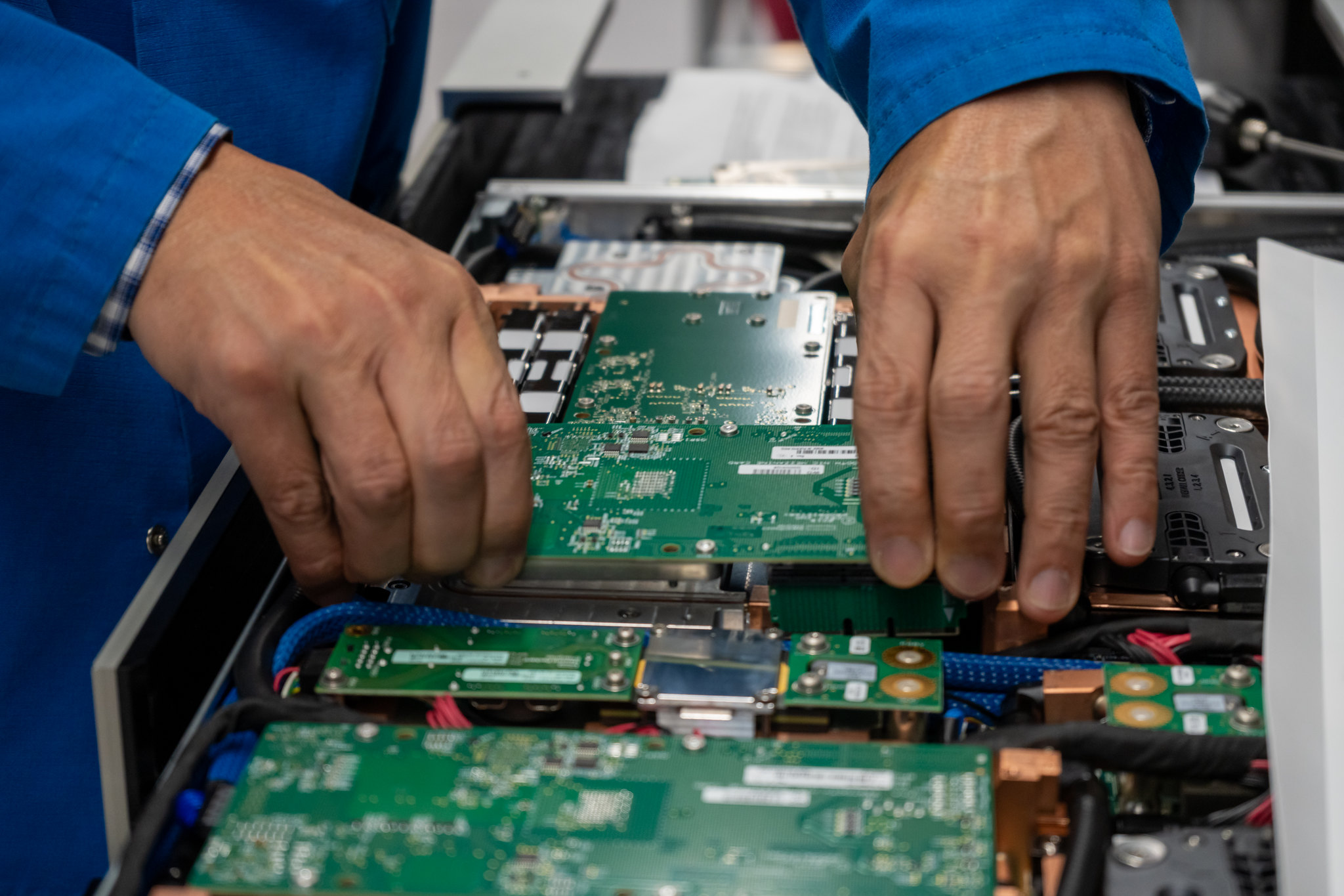 Is the Top500 meaningless? Not so, says US national laboratory CTO
In-depth LINPACK may measure only one process, but there are real and meaningful use cases for exascale systems


-
 Gaining timely insights with AI inferencing at the edge
Whitepaper Business differentiation in an AI-everywhere era
-
 Scaling AI from pilot to production: Maximize AI impact with HPE & Intel
Whitepaper Transform AI proof-of-concepts into full-scale implementations
-
 UK supercomputer boom as HPE and Dell receive funding for new AI cluster
News The UK’s AI computing capabilities will increase by an order of magnitude in 2024
-
 AI gold rush continues as Hugging Face snags $235 million from IBM
News The investment round, which brings the company's valuation to $4.5 billion, also includes Amazon, Google, Intel, and Salesforce
-
 Why is ASUS reviving Intel’s NUC mini-PC line?
News The diminutive PC is to rise again while analysts look for the business case
-
 Intel targets AI hardware dominance by 2025
News The chip giant's diverse range of CPUs, GPUs, and AI accelerators complement its commitment to an open AI ecosystem
-
 Why aren’t factories as smart as they could be?
Whitepaper How edge computing accelerates the journey to a remarkable factory


