


The Nokia N97 is probably Nokia's most long awaited smartphone, with many comparing its potential talents to the original Nokia E90 Communicator, a device that some view as the best business device ever.
Yes, both feature a hidden full Qwerty keyboard, and both use the Symbian S60 operating system, but what has Nokia added to make the N97 look and feel more advanced?
Firstly, there's that touchscreen. It's bright and clear, measuring 3.5in, however, it's not as high resolution as similar devices at 360 x 640 pixels, but this isn't particularly noticeable.
The Nokia N97's screen is resistive rather than capacitive as the iPhone's screen is. This means it's nowhere near as responsive and is a little hit and miss when trying to carry out tasks such as typing on the virtual keyboard rather than using the hardware keyboard.

However, the screen does take on a widget-based interface, that comes in handy if you're the sort of person who has little time to trawl through the internet or your phone for information.
One very handy addition to the Nokia N97 that wasn't present on the 5800 XpressMusic is the proximity sensor. A big issue with touchscreen handsets is that when you're talking on the phone, it's all too easy to trigger up an unwanted application when you're chatting away on the phone. The proximity sensor switches the screen off so you can't accidentally start the music player or any other app while you're on the phone.
Navigating round the Nokia N97 is somewhat of a chore and demonstrates that the Nokia S60 rel.5 interface hasn't been thought out as well as it should have been. Scrolling isn't as simple as on an HTC device or the iPhone. You have to use a scroll bar rather than the whole screen and that becomes fiddly. Also, buttons are used for different things in different menus so you'll have to remember what does what where too.
Sliding the screen up, as on the HTC Touch Pro2 enables you to access the full Qwerty keyboard.
However, the Nokia slide is leaps and bounds behind the HTC. The slide isn't smooth at all, and is easy to trap your fingers in, resulting in blood blisters galore. The struts aren't metal, but plastic, leaving us wondering exactly how long the screen will stay attached to the keyboard and there isn't the option to have the screen lay flat, making it hard to type without the aid of a flat surface.

-
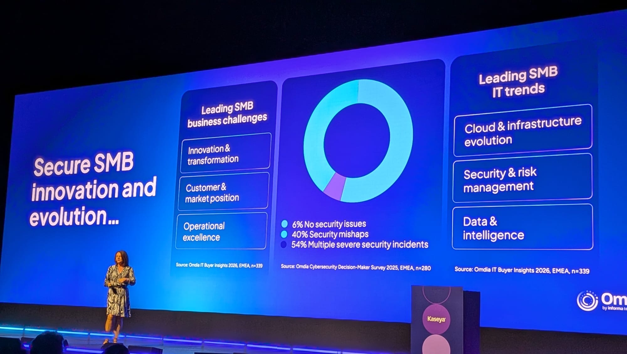 MSP 3.0: Managed services enter a new era
Automation, AI, and growing compliance demands are forcing MSPs to rethink their role, moving beyond traditional IT support towards a more strategic advisory model.
-
 Legacy kit behind vast majority of cyber attacks on utilities
News With equipment and software poorly suited to withstand modern cyber threats, organizations need to do more to identify unmanaged or vulnerable systems
-
 UK faces huge AI talent shortage
News As global hiring gets easier, many organizations are recruiting from overseas


